Sinathir 0.18 - Hints, Age 17 and more

I decided to release this version early for multiple reasons. First of all, the official goal of adding hangout option to one npc is not in this update. I will release another, much smaller update before the end of this month which will have this option. I mainly wanted to release this update because it does away with the mandatory font instalation and fixes some other rather anoying problems. This is going to be quite a long post.
No more font instalation (for most people)
Let's explain the problem first. RPG maker XP is a very old engine. It does and can do everything I want it to, but there are some minor, very anoying things that bother me. Using custom fonts is one of them. Simply put, the game makes a list of fonts it uses the moment you start it up. It checks if these fonts exists and that's it. It doesn't install fonts, or loads them into memory, it just checks for them and uses them if they are installed. This list of fonts, as far as I know, can't be updated after the game started. There are multiple solutions to this problem and none of them are satisfactory. There is a launcher that makes two executables run at the same time to make custom fonts work without the user having to install them, there is another script that requires you to run the game twice (first time it installs the font and quits the game, second time works normaly). I could also just pack the game into a installer that would install both the game and the fonts, but I personaly don't like installing small games like this. The best solution is he memory font loader, which loads fonts in a folder into memory without installing them, which is what most games these days do. The problem is the font list that is built at the start of the game. So you run the game the first time and the font is not there. You run it again and suddenly the font is showing up. As far as I know, only way to trully fix this is to decompile or reverse engineer the exe running the game, which is way out of my league. Someone did exactly that, but the only link I found was on some old german forum with downloads disabled to guests and with new registrations turned off.
So I just said fuck it and decided to use default windows fonts, Cambria and Verdana. If I'm correct, windows from 7 and up have these fonts by default and RMXP games don't run on mac or linux out of the box anyway. So now the game should run without you having to do pretty much anything.
Only people running OS older than windows 7 or not running windows at all will face problems, and these can be fixed by simply instaling these fonts.
I'm aware that this is not a perfect solution. In the future, I will probably ditch normal fonts all together and just use some form of bitmap font, which should make the game run without problems for everyone. This should however make things bearable for most people for now.
In-game hints
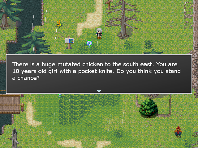
I was kinda suprised how many people get filtered by the "chicken" at the start of the game. I have a simple solution to that. I added one line of unskipable dialogue that tells you to run away from everything you see at the start of the game. I also added a optional hint system. You can turn this on and off from the options menu. This will put question marks into several places around the world explaining certain mechanics and giving new players small hints. So if I see anyone complaining about the overpowered scavenger at the start of the game, then you have only your self to blame for not paying attention.
Signpost improvements
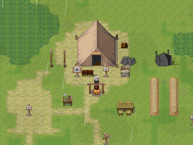
I added signposts to most map exits, since people had problems with those. Now most exits are marked with a signpost. Some are still kept unmarked so exploration is still rewarded. I also updated the graphics for fast travel and building signs.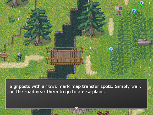
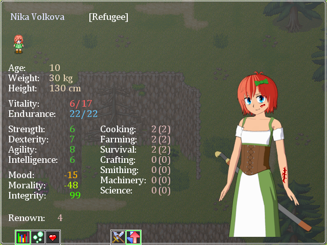
Age 17 sprites
I also finished all sprites for the last age stage.
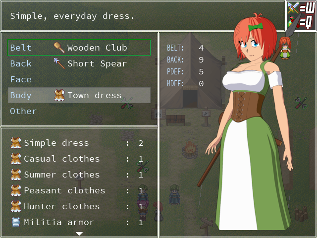
New weapon placement
In the end, I decided to keep all weapons in the game and put them behind the character while removing the belts. Bad thing is it doesn't look as good as it did before. Good thing is that it keeps the outfits look clean and it saves me hours, maybe even days of work when I want to add new weapons or outfits.
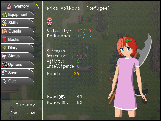
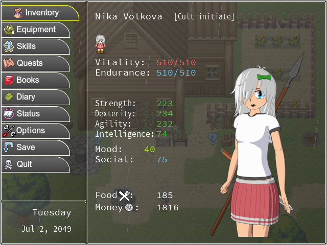
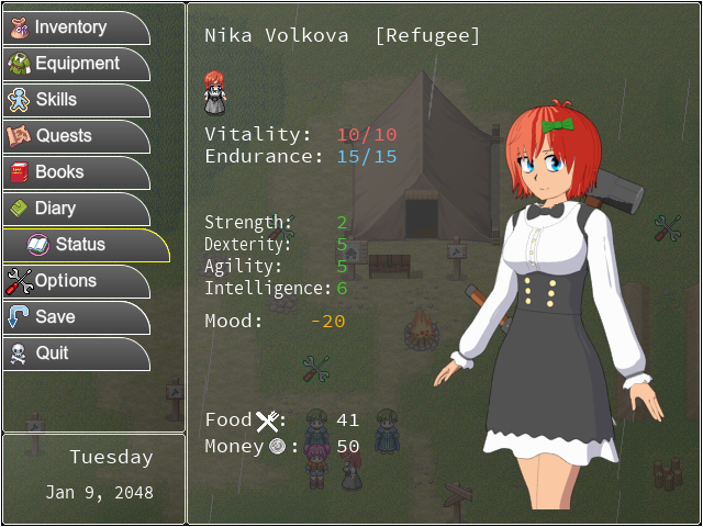
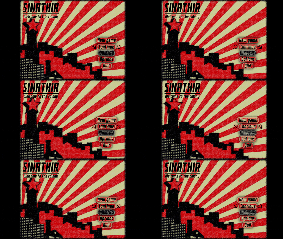
Animated menu
I experimented with animated main menu. Changed the background music (www.youtube.com/embed/SsVMIe7QbJM). This is mostly just a experiment and not final. It also does change slightly after you finish the game for the first time. I would like to add more things like this in the future.
Other smaller changes
I also did a bunch of other smaller changes, fixes and additions.
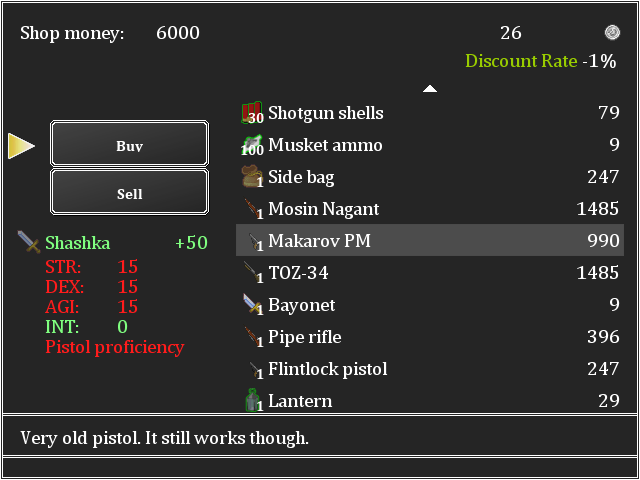
Added weapon stat requirements into the buy menu so now you will know if you can't use certain weapon before you buy it. Only few weapons actualy have stat requirements for now, but I will be adding them to most weapons as time goes on.
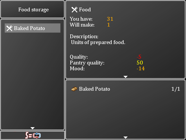
Storing food recipes now also show without the "STORE:" word before them.
And more. Made one part of the initial dialogue not skippable, so you don't turn on tutorial accidentaly on your second playthrough, fixed some problems with fulscreen turning on and off in certain situations, fixed the broken fridge upgrade if you upgraded your safehouse to second level, and other things.
This is a pretty big update. Probably the biggest one yet if you consider all the changes I had to do to some pretty old systems. I'm sure there will be plenty of bugs. Most hopefuly minor. New font will break some text, some weapon sprites might be badly aligned or missing. If you find anything wrong, report it here. Can't fix it if I don't know about it.
Full changelog:
- New main menu
- Put all settings into one file
- Fixed fridge upgrade not working after improving the safehouse
- Added "enable ingame hints" option into the game setting screen
- Added signposts to most map transfer spots to make exits more clear
- Fixed some broken parts of the fullscreen setting
- Did some minor changes to initial dialogue to make accidentaly turning on tutorial harder
- Removed dependency on "Source code pro" font. Replaced it with default Windows fonts
- Added a warning window that shows up when the game is not running on windows or if the fonts are missing
- Food storing recipes now show without "STORE:" before their names
- Weapon stat requirements now show in the trade window before buying
- New weapon sprites and placement
- Improved character sprites for age 10 and 11
- New sprites for age 17
Files
Get Sinathir
Sinathir
Raising sim / survival game inspired by Princess Maker.
| Status | In development |
| Author | QuentinWH |
| Genre | Role Playing, Survival |
| Tags | 2D, Anime, Coming Of Age, Female Protagonist, Life Simulation, Management, RPG Maker, Singleplayer, Top-Down |
| Languages | English |
More posts
- Version 0.43 overview and next update74 days ago
- Sinathir 0.43 - Dialogue topics, new locations and moreAug 12, 2025
- Sinathir 0.42 - Finishing dialogue topicsFeb 12, 2025
- Poll results and what's nextFeb 01, 2025
- Important PollJan 03, 2025
- Sinathir 0.41 - Prologue + new cutscenesDec 19, 2024
- Sinathir 0.40 - Faction system and QoL improvementsAug 04, 2024
- Sinathir 0.39 - Schedule and favorsApr 11, 2024

Comments
Log in with itch.io to leave a comment.
I just finished a run today (ended with me getting easily dispatched by some bandits asking for a toll). Game is more fun with each patch - I am really a fan of the weekly message the MC has. Such a small change brings big life into the atmosphere and story.
It is also clear that a lot of work went into the beginner section, aimed for new players. With that, I played this run as if I was a new player, instead of just zooming for party members to crush combat easily. My impressions are as follows:
The hints are a really good addition, same with the Mutant Chicken warning message. I can only imagine how many people start the game and immediately go fight / die to the chicken.
My biggest suggestion would be to aim for a more direct approach. While a lot of the hints showed me how certain aspects work, a new player will read through everything and know exactly how crafting works- but won't have a clue where to go or what to do. The only hint they have at this point is to go see Billy to the South West. So they go and he's not there! At this point a new player will sit there and scratch their head.
I think this would make a good first quest (maybe disabled by turning off hints somehow?). The idea is that you wake up, and maybe you want to talk to Billy about something. Reaching his house could give a quest to go find him, with perhaps a hint to where to go directly. The only reason I knew where he might be is due to me playing previously - so maybe he leaves directions on his note.
Another thing would be to give a broad quest. We know food is important from the tutorial - perhaps a quest to get 'X' food type or 'Y' amount of food, and the quest would give a hint to go somewhere or talk to a person. This method of having a broad starting quest (the letter) with a very specific tutorial-like quest reminds me of the STALKER series, where they lay in the plot questline immediately, and slowly drip-feed specific & short 'nooby' quests that also help advance the main plot, or deal with something mentioned previously (in this case, the tutorial). I personally love that design, since it feels like I'm progressing towards the main plot without having to do throw-away quests like "kill 10 boars" or whatever.
While I get that a lot of the game is about discovering people and places, I think that many players who aren't familiar with the game won't make it to town. It's an issue with indie games, where a game could be super deep or super empty, and a player will have no way to tell from their first impressions - they might just assume 'this is all there is to it' due to them not knowing where to go. I know for sure this is an issue people encounter with my game, where they just don't know what to do and feel stuck, and then end up assuming there's only 15minutes of content and quit.
Otherwise, the other changes are also nice. The signposts help a lot, and I like that some paths don't have any and require the player to remember the geography/layout of the level to discover them.
The main menu is a huge improvement from the previous one. I especially like the background visuals.
Since I focused a lot on first impressions, I also made sure to note a couple of grammatical/phrasing issues and UI snags. While some phrases are grammatically correct, they end up sounding awkward. Perhaps they were intended, but I included them either way.
During the Tutorial
"Sergeant" instead of "sargeant"
"a note next to the door" instead of "note"
"I will search around for a suitable spot" instead of "I will search this place for a suitable spot"
"Meanwhile, go find some wood and stone" instead of "You will go, and find some wood and stone"
"Crafting requires resources" instead of resourcess
"Bring potato to Billy" instead of potatoe
"Low Quaility" on the Food Hint message
"Plain" instead of "Plane" on Hard Tack food description
"Crafted" instead of "crafter" on the hint to the left of the tent
"People like Billy who lives here" could be written as "For example Billy, who lives here, left a note . . . "
Talking to Zacharias
(first time I encounter this character - they're fun! Same w/ the healer girl)
"myself" instead of "my self" (happens a few times)
"individual's situation" instead of "individuals situacion"
"We give them the material goods they need"
Here are the only UI issues I've had
Tutorial quests block some of the UI when interacting with the fireplace too early
The top part is cut off - maybe due to overall window size?
Some other small issues: Only two resolution options (tiny window and full screen). Would be ideal if I could scale the window bigger, since I like having things in windowed mode due to having multiple monitors. Couldn't get it setup from the start, so I just left it on the small window. Forgot to check if I could change it from the game after the main menu, though.
Tiny bug near the oak w/ hole where you put in the coins - the terrain visuals don't match up with the walkable path a bit on the left.
Got the book "Mystery of Sinathir" (from the church place) but it didn't show up on the books tab? Getting it again told me I already had it, but I didn't know where it was.
Overall, a great improvement. With some tweaks and more noob-friendly handholding, you'll have something excellent on your hands.
Can't wait for the next patch!
Thanks for playing the new version!
In short, most of the things you said are right. I'm either planning to do them, or add some variation of them. There are so many things I have to do that are all important to some degree that some of them are simply left unattended for way too long.
I saw some streams or videos of people playing the game. What seems to me like the biggest problem is the fact that people have no idea what to expect from this game, or what it actualy is. Most people see rpg maker and decide that this is just a ordinary linear rpg where you just walk around and kill everything, which this is deffinitely not true. Hints partialy fixed that. I saw someone playing the newest version and he played slightly differently than most people did when they tried the version without hints. I'm quite open to making the game begining easier and adding more hints and tutorials, but I don't want to make the game completely braindead with minimaps, arrows and popups showing up after every step. The systems I have right now seem adequate. I just have to expand them more.
The problem with Billy not being at the farm is quite easy to solve and I have no idea why I didn't do this earlier. The random npc locations get triggered the moment the game starts. I can simply force Billy to stay at his house for about two weeks so everyone can meet him there.
As for the beggining quests, this sounds like a good idea. Maybe he could just give the player a piece of paper with some basic goals, like get 60 food, 100 silver, make a friend and so on. Could give some early game goals and is easy to ignore for subsequent playthroughs. Or I can just do bunch of proper quests. Suong has one that makes the player walk around to teach them where everything is. Won't be too hard to add more of this kind of stuff.
As for directions, these are kinda already in the game. Usualy, when you see a word in green color, it means it is a topic you can talk with other NPCs about. Sadly, very few npcs actualy have any dialogue about these topics. You can read the note, get Riverstone topic, find the bridge guard, talk to him and he will tell you where that place is. I didn't add hint about that kind of dialoge in the game yet because of how inconsistent the dialogue is. For now, I added few more hints that tell the player about some important locations and I added some more signs to buildings, so people can tell which are important.
As for the main plot, it already works similiary to what you propose. It just isn't comunicated to the player enough so very few people even know it exists. You have to deliver a letter, but nobody knows where the guy is. Turns out only the leaders of the main factions know. You can't even enter their towns unless you have trade papers. You get trade papers by showing all the main NPCs in the starting area that you can actualy be useful. Getting these papers is how the main story ends for now, since it is not developed further yet. This pretty much serves as a extended tutorial. NPCs will give you the signature only if they like you, or if you do some simple quest related to their profession. None of this has anything to do with the actual plot, but moves you forward and should naturaly teach the player about all the skills, all the NPCs and that things usualy have more than one solution.
The confusion with new players is a big problem and I don't know exactly why. People IRL that played the game didn't really had any problems and could figure out where most things are quickly. Streamers on the other hand missed plenty of things in plain sight. One of them for example didn't notice the inn where all the NPCs were and he didn't notice the backpacks with items laying on the ground. Most likely has something to do with them wanting to cover as many of the AGDG games as posible so they are not really focusing and just rushing through things or,...
The resolution. Being locked to 640x480 sceen makes a lot of things barely visible on modern screens so they simply missed those things because they were too small. This might also be a problem, which I don't think I can fix. The engine is too old and slow. There are ways to increase the resolution, but all of them tanked the performance hard. On modern hardware no less. Having the simple fullscreen / window toggle is the best I can do without switching the engine completely. I will try to look around the net for some kind of solution, but the whole situation quite reminds me of the time when I tried to make Diablo 2 run at high resolution. it just made the screen show more of the map and kept the size of NPCs and everything else small.
As for the gramatical errors, There are LOADS of them. It is no secret that 99% of all dialogue in the game right now was writen on a spot without much thought put into it. I will be fixing some of these typos, but I want to focus on dialogue more once all other things are set in stone. I want to make dialogue more lively and I will have to add NPC animations for that to happen. Once I have these systems in place, I will write proper dialogue and do proper grammar checks. Think of the current dialogue and text as placeholder.
And as for the text getting cut short in some windows, I'm sure you are going to love the next version since I'm getting rid of all the vector fonts and I'm moving to bitmaps instead so no more installing fonts. It works alright, but I'm in the process of manualy adjusting pretty much every window in the entire game. Initial versions will have some badly displayed text and missing colors, but I think this is a necesary step. Installing fonts was very anoying for the majority of people and some even didn't know how to do it.
I will try to fix all of the smaller issues you found. The book is actualy one of the first items I added into the game and I completely forgot it existed. After some testing, the book appears in your inventory and must be "used" before it appears in your book library. I will change that also.
I really thank you for playing the game again and taking your time to write all that down. It really makes things easier for me and it also is good to know that people like what you do. Thanks.