Sinathir 0.26 - Re-worked farming, longer item description
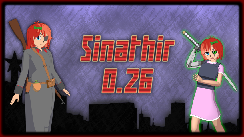
While this version doesn't add anything that could be considered ground breaking, it still changes quite a few fundamental systems and game mechanics. That means this version is NOT compatible with any previous save files. Your unlocks are still valid and will work. Even imprints should work without any problems. This nicely leads to the first new thing.
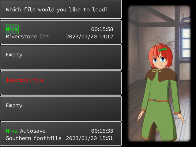
Incompatible save files now don't crash your game when you try to enter the loading screen. They will have different name and you won't be able to load them. Overwriting them with new save files works normaly. Should remove the confusion when you tried to load old saves on new game version and the game just crashed. Now for the main changes in this version.
New farming system
Old farming system was not my original work. I found it on the internet years ago, back when I knew pretty much nothing about programing. That system was well done, but it had some questionable design decisions and was designed for completely diferent type of game. I did some changes to it to make it work slightly better, but I had very little programing experience at the time so the result was not very good. It was laggy, few of the features like plants regrowing or seasons support were broken.
So I decided to make a new one from scratch. It is quite simplistic, but easier to expand. It also doesn't lag and supports all the features I want it to have.
Here is how it works. In your hideout, there is a new tool chest.
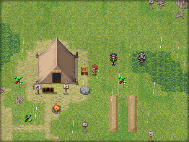
When you open it for the first time, you will get a short message telling you to learn the basics of farming from Billy and to get some seed. Next time you open it, you enter "farming mode".
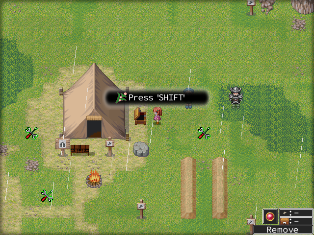
New hud element will appear in the bottom right corner and you will get a short popup telling you to press shift. Hud will show you your selected seed /tool, the amount of seeds you have and how much produce resulting from that seed you have. Pressing shift will open the new seed selection screen.

This screen shows you all your seeds and it displays important information about the selected seed. How long the plant grows, how many seeds you have, how much produce you get from harvesting one plant and how much produce you already have. Once you select the seed, you can start planting. You don't have to select the seed for every tile like you had to before.
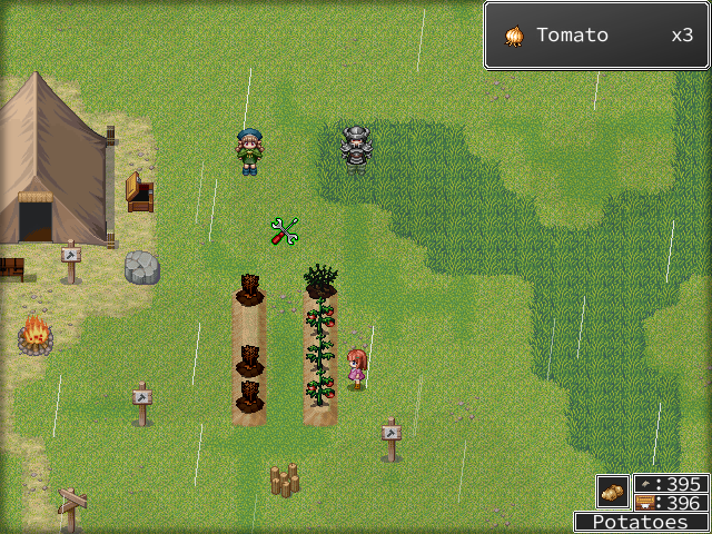
You also don't remove plants by interacting with them. You have to select the remove tool from the seed menu first, so now you won't remove any plants by accident. And if you interact with ripe plant with this tool selected, you harvest it normaly instead of destroying it.
Farming mode gets turned off once you rest in your tent, close the tool chest or leave your hideout, so the hud won't bother you anywhere else in the game.
I also rebalanced most of the plants in the game. Some take longer to grow, give more/less produce or they dont get destroyed once harvested. It's a completely new system. I tested it, but there might be some bugs, so be sure to report them if encounter any.
Longer item descriptions
Another thing I wanted to do for a long time. Old description boxes were small and were pretty much broken since I switched to bitmap fonts, cutting some longer text early. This not only allows me to make longer and more detailed descriptions, it makes it pretty much imposible for the text to be cut off early.
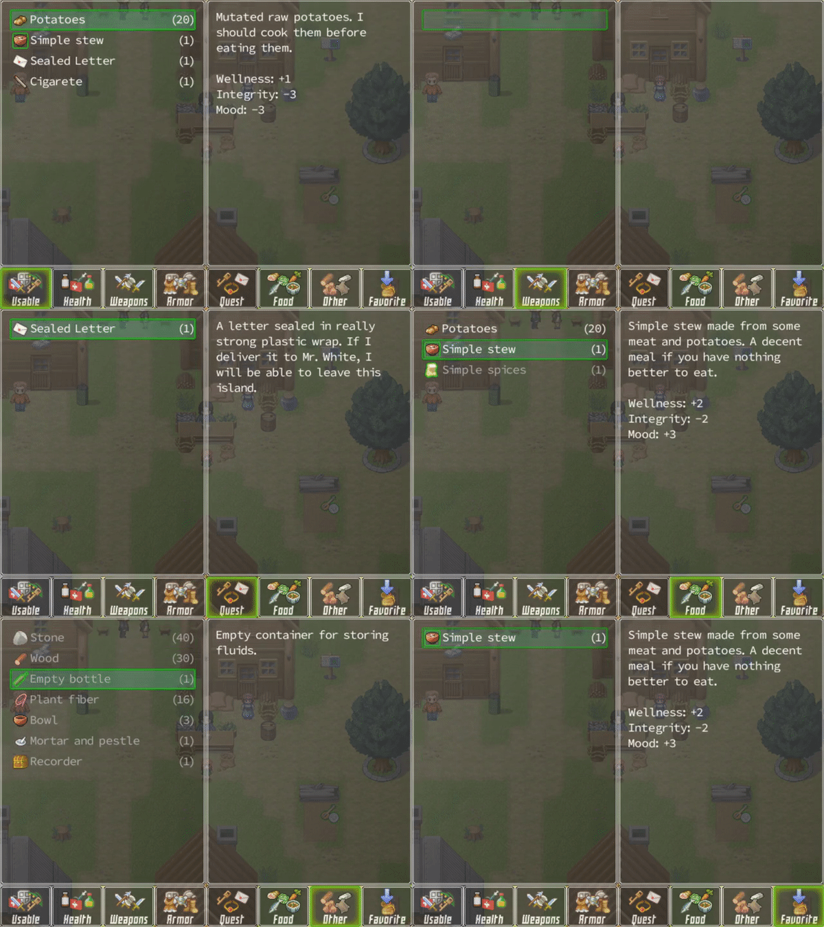
Inventory screen changed a little too. The "ALL" tab was removed and replaced with "USABLE". Usualy when you go to your inventory, it's to eat some food or use some other item. I also rewriten the default way items in inventory were rendered. In older version, when you had large amount of item types, the game could take several seconds to load your inventory. Now items are loaded on demand, which makes inventory loading pretty much instant.
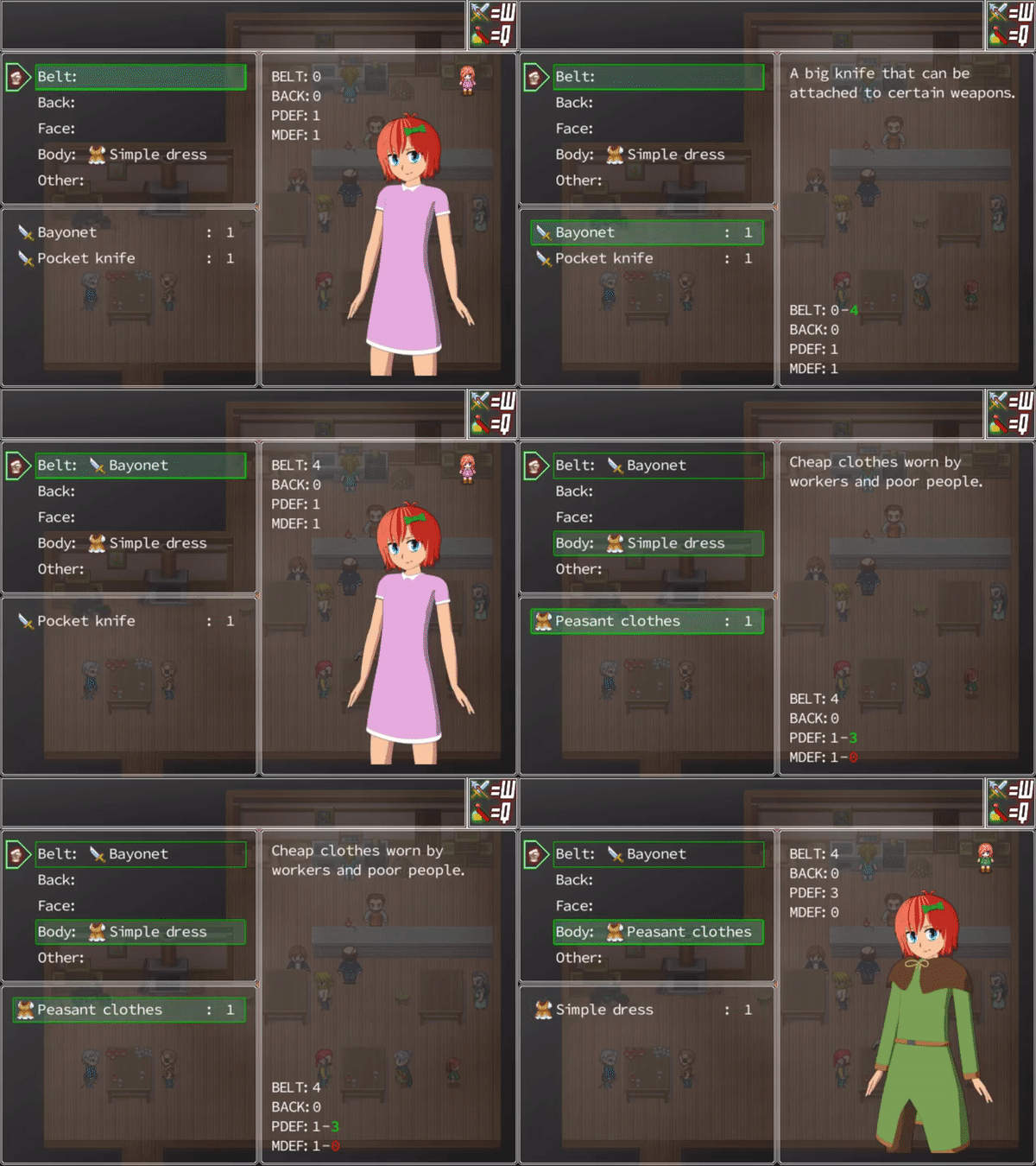
Equip screen also has the expanded description box.

Same goes for the trade screen.
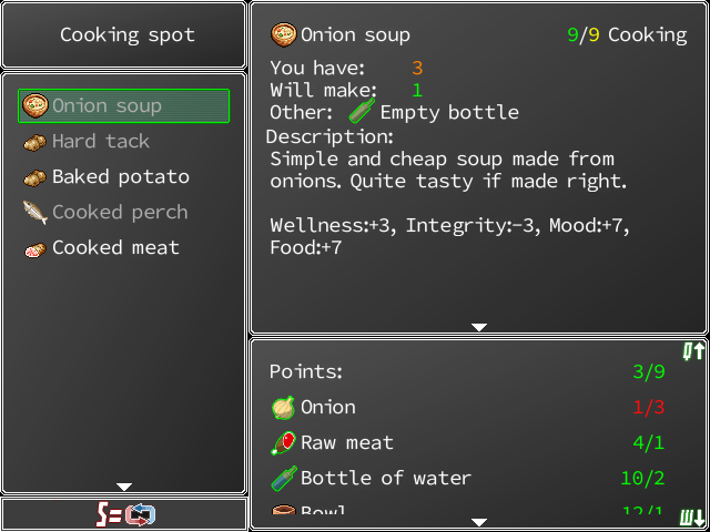
And the crafting window.
I also added a small hint to this window. You can scroll the ingredient portion by pressing Q or W. Most items still use default description text, but I rewrote them for all edible food items and for all drugs/drinks.
Again, this is a prety big change to the core game. It is quite possible there will be some bugs. Report them if you encounter them.
That's pretty much it. I also did some minor changes to other parts of the game, but nothing major.
Next update will most likely take longer to make. It should contain the war system. I will either try to polish it as much as posible and release it later, or I will make only the bare esentials work and release it sooner. I will most likely do the second option. I don't like releasing something too unfinished, but I also don't want to spend weeks working on something only to find out nobody likes it. The sooner I get some feedback, the better.
Full changelog:
- Completely reworked farming system, making it faster, smoother and deeper
- Added large item description boxes to equip, trade and inventory screens
- Incompatible save files now show red and are unable to be loaded instead of crashing the game
- Adjusted combat values of some enemies
- Tavern now sells random food every week
- Various minor changes to the way the cutscenes are handled
- Minor edits to the week start event and autosaving
Files
Get Sinathir
Sinathir
Raising sim / survival game inspired by Princess Maker.
| Status | In development |
| Author | QuentinWH |
| Genre | Role Playing, Survival |
| Tags | 2D, Anime, Coming Of Age, Female Protagonist, Life Simulation, Management, RPG Maker, Singleplayer, Top-Down |
| Languages | English |
More posts
- Version 0.43 overview and next update61 days ago
- Sinathir 0.43 - Dialogue topics, new locations and moreAug 12, 2025
- Sinathir 0.42 - Finishing dialogue topicsFeb 12, 2025
- Poll results and what's nextFeb 01, 2025
- Important PollJan 03, 2025
- Sinathir 0.41 - Prologue + new cutscenesDec 19, 2024
- Sinathir 0.40 - Faction system and QoL improvementsAug 04, 2024
- Sinathir 0.39 - Schedule and favorsApr 11, 2024

Comments
Log in with itch.io to leave a comment.
Gave it a playthrough after seeing the new patch! This time I tried to go as far as I could, but my run was ended after getting party wiped by a bear! (more on that later)
So as always, great work. I'm always happy to see some changes that I recommended before be implemented! Things like typing your name in, Billy being available at the start and so on.
So, here's my thoughts in a chronological order. The early game stuff is really minor since I feel as if most of my issues were addressed already, and things work as how I'd expect them to.
>When selecting New Game, 'Press [Esc] to continue' is a bit awkward, if I just pressed Enter to confirm a New Game. I'd rather it be something closer to Enter, or just reuse that key. If not enter, maybe 'Space'
>Potential confusion for new players when picking class. The game just starts off, no confirm button or anything. A player might not be sure if the selection went through.
>Skipped the tutorial since I remember most things at this point. No issues here. I left the tips on just incase.
>The "NPC Walking away" animation is really long and gets old quick. Happens with John and the religious folks when Helena leaves. No clue if this is an engine limitation, but I'd like to either be able to move immediately or have them walk twice as fast away. While the current setup makes sense, it's sacrificing gameplay for immersion, which I never like. This is made worse since I like talking to John for tips, but I just end up picking up my phone or doing something else out of the game while he walks away. It probably isn't that long, but it just feels long since I think "alright I can't move for a few seconds now".
I like the new descriptions and inventory visuals. I have a suggestion for things like food:
since you already have a lot of space (maybe not for bigger items later? but I didn't find any that felt like was taking up too much space) you can easily give the stats their own line, and some color coating helps. Perhaps you can assign a color to all 3 stats as well. There is a visible contrast between the quality of the bottom bar (great) and the top part of the screen (simple white text on transparent background). I'd focus on that if possible.
It's also a good segue into another topic: I think the amount of content as this point is solid. Every playthrough I discover either a new interaction, or event, or characters. I think it's a good idea to start highly polishing the early game section and idiot-proofing things. Things like adding tooltips to the starter items and having characters explain things more. An example would be:
Billy gives you the seed chest tool. I went back to my hideout and knew how to place it, but I think that's because I've done it before. Perhaps in his dialog, Billy could give another line of "Remember - use the signpost in front of your tent to set this up. And if you want to get seeds, you'll need . . . " and so on. I guess I could call those "immersive tutorials" that explain things as you get them without them feeling forced.
Same with messing around with your base. Clicking something that would offer you 0 options - like crafting with no craftable items - should tell you "consider doing X, or talking to Y, or getting Z" to have things to craft. Really, just giving players some answers, at least at the start. I think this is only an issue do to the availability of exploration. A player can really go anywhere and get lost easily while looking for answers to some basic questions, like "how do I learn cooking recipes". If they haven't gotten John's tip (or forgot it, misread it, or want to learn early) they can wander about and get overwhelmed with things. Anyway, I think this also fits in the "minor" issues, and I might even be overthinking it, since I didn't have these issues due to previous experience.
Another example of idiot proofing would be the Billy potato quest - to turn the quest in (which isn't done automatically? it should!), I need to go to the quest TAB, not the quest option listing, which the player has experience doing. Someone who just isn't good at games can get stuck here easily. While playing this time, I remembered that I needed to do something -extra- to turn this quest. So I went to Billy, couldn't turn it in by clicking the Quest option, went back to his place to double check - then remembered that I needed to mess with the quest Tab for it to work.
Everything else made sense and I had no issues. I did the Kobold questline, got Alf, talked to Helena and started the Bloodstone quest, did some Suong traps.
>In the screen with the elevator machine and the mine - if you walk down from the elevator, you can enter(walk through the hill visuals) a hilled area (?) but you can't leave it. Needed to reload here
>With Alf, Suong and George, I went about clearing the map. I found 3 Kobolds around the area with the hidden Church. Cool, they got owned and I didn't lose a hitpoint. One screen away is a bear. I thought to myself that it wont be hard since I can kill 3 humanoids (Suong/her kid has a gun? that's probably strong!) Big mistake! The bear one shots everyone - Game Over!
I think this is a bit cruel since it's difficult to gauge the relative strength of enemies. While it's clear that my character can't do anything, the other 3 felt like they were clearwing the rooster beasts and kobolds super easily - this enemy is in the same area so I figured he'll be of the same approximate difficulty.
Luckily, autosaves work and I will resume my adventures later.
As always, great work! I think the fact that my biggest complaints are very minor things is a sign that the game is in a good state and progressing well.
Thanks for playing through this version. I'm glad nothing broke down, since people usualy report atleast one crash or fatal bug I missed.
I will look into it. I don't want it to be a enter/space button because it would be quite easy to skip over that screen by accident. However, ESC is not the only button that works.
When you turn on the game for the first time, you get a control overview screen showing you all of the common buttons. It doesn't appear afterwards, but it is also in the "Controls.png" in the root game folder.
"ESC" and "num0" and "X" have the same function, so you can press any of these and they will work. I'm afraid I can't really comunicate that to the player that well though. If I say "press the B button", it will mean nothing to them unless they go to the options menu first. I will try to think of something.
That is something on my to-do list. I plan to remove the screen and replace it with ordinary point perk buy system like in cataclysm, zomboid or pretty much any modern survival game. And even later, I will add a short linear intro section where you make multiple decisions, which will give you perks and bonuses depending on them. Subsequent playthroughs will allow you choose perks freely.
I could fix that. It works like it does now because it doesn't cause any problems and is easier to do, but allowing the player to move while they walk away can be done too.
I like the new descriptions and inventory visuals. I have a suggestion for things like food
I actualy had the window look like that in the early version, however that didn't work properly in the crafting window.
As you can see, puting those stats under each other would make them not fit in there. I would have to resize other windows and make them smaller. I will definitely do something about it, since I'm not really happy with it either. Probably asign different text color to each stat or replace the text with icons.
Thats pretty much a constant battle for me. While most of the things you said are valid and I will adress them (Billy telling you about installing crafting stations is a good idea), I also don't want to make the game explain things "too much" and I want players to figure certain things on their own naturaly. There is a questlog in the menu that shows you the quests you get from John, so players can read again what they have to do and if they go through the tutorial, they will learn how crafting stations and skill learning works so they wouldn't be confused by empty crafting recipes. I will be improving this part of the game for sure, but I also have to stop somewhere, since I could easily just place tips everywhere, place quest reminders and popups all over the screen and some people would still get confused.
That's definitely something I will adress. I will simply rename the "Quest" option into "Get quests" or something similiar. I can also make the quest tab glow a little if you have a quest ready to be turned in or something.
Found the problem and fixed it.
That's something I also strugle with. I think the biggest problem are the graphics. Kobolds and the scavengers look too big. They are suposed to be smaller than the player, but I don't have the graphics for them. The bear doesn't look that much bigger than them, so it is hard to take seriously.
As for its location, I actualy want it to be like that. I want the world to be designed in a same way the gothic games are. You have weak enemies mixed with strong enemies in pretty much every location. Strong enemies are easy to avoid, or they guard some kind of treasure you are meant to get later. I really like this, because it doesn't make earlier locations completely obsolete once you get too strong. Getting killed by a strong enemy early also makes killing it later much more satisfying than just going through a map with linear difficulty progression.
Anyway, thanks again for playing through this version. I will adress your points and release small version in a couple of days.